Kunena 7.0.4 Released
The Kunena team has announce the arrival of Kunena 7.0.4 [K 7.0.4] in stable which is now available for download as a native Joomla extension for J! 5.4.x/6.0.x. This version addresses most of the issues that were discovered in K 6.2 / K 6.3 / K 6.4 and issues discovered during the last development stages of K 7.0
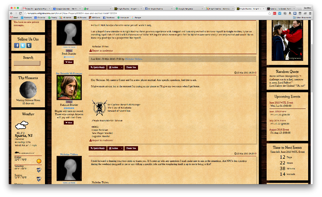
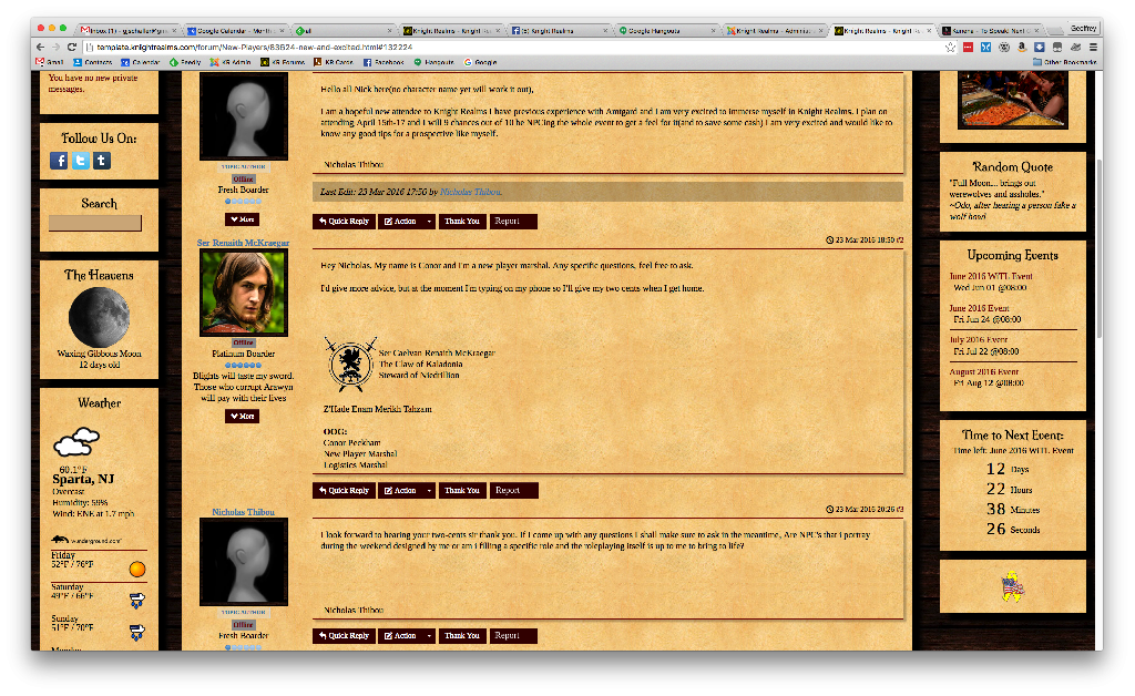
Solved Suggestion - move Report link to same area as other actions
- GJSchaller
-
 Topic Author
- Offline
- Premium Member
-

The main suggestion I can think of is to move the "Report to Moderator" link from its own line within the message body, to be a part of the same line / grouping as Quick Reply / Action / Thank You" - this keeps it consistent visually, keeps it easy to find, and is one less link to distract from the body of the message when reading.
Also, the combination of Reply and Quote into a menu is awkward - it's a menu for only 2 items. I would suggest breaking them out, or combining the other actions (Thank You, Report to Moderator) into the same menu.
Geoffrey Schaller
Technical Officer
Knight Realms
Please Log in or Create an account to join the conversation.
- GJSchaller
-
 Topic Author
- Offline
- Premium Member
-

Geoffrey Schaller
Technical Officer
Knight Realms
Please Log in or Create an account to join the conversation.
Another suggestion might be
What do you think?
_____
*The ability to see the IP address is controlled with a configuration setting, of course.
Blue Eagle vs. Crypsis reference guide
Read my blog and

Please Log in or Create an account to join the conversation.
- GJSchaller
-
 Topic Author
- Offline
- Premium Member
-

Moving the [Report] button and the IP Address to the same line under the message body would do the trick, you can float the IP to the right while keeping it inline with the buttons.
Geoffrey Schaller
Technical Officer
Knight Realms
Please Log in or Create an account to join the conversation.
Well, to be fair, that's a criticism (rather than a bug) with the overall design of Crypsis. As you say, in the topic subject, you're only offering a suggestion.GJSchaller wrote: My main concern is getting more data on the same vertical line, so that there is less scrolling, and less cruft between the body of the messages.
In comparison with Blue Eagle (and many custom/third-party designs based around it), Crypsis generally occupies more screen real-estate. That's not a criticism, that's just stating a fact. Depending on what kind of Joomla/Bootstrap template and viewing device you're using, Crypsis can occupy markedly differing quantities of screen real-estate. I know what it's like to spend a couple of hours refining the line-height, the margin-top/bottom and padding attributes to reduce the physical effort involved in scrolling up/down in order to read through forum topics.
But, again to be fair, the issues you raise now were present from the beginning of K 4.0 Crypsis going back a couple of years.
Perhaps you're right; report-to-moderator feature takes up a bit too much space. It may be a good idea to hide it away—tuck it under the actions button. It's been difficult enough explaining to my own users where to find things like reply, edit, etc.; hiding another feature like report-to-moderator shouldn't be much of a further problem (because most members of my communities don't use it).
Blue Eagle vs. Crypsis reference guide
Read my blog and

Please Log in or Create an account to join the conversation.
Please Log in or Create an account to join the conversation.


