

- Posts: 47
- Thank you received: 1
Kunena 7.0.6 & Kunena 6.4.12 – Security Updates Released
The Kunena team has announce the arrival of Kunena 7.0.6 [K 7.0.6] in stable which is now available for download as a native Joomla extension for J! 5.4.x/6.0.x. This version addresses most of the issues that were discovered in K 6.2 / K 6.3 / K 6.4 and issues discovered during the last development stages of K 7.0.
The Kunena team is also pleased to announce the twelfth version of Kunena 6.4, a native Joomla extension for Joomla! 5.0, 5.1, 5.2, 5.3, 5.4 and 6.0.
Question Template Behaviour on Mobile Device
3 years 10 months ago #224383
by unker
Template Behaviour on Mobile Device was created by unker
Hi,
I have a fresh install of Joomla 4.1.5 and Kunena 6.0.1.1 and I wonder that the template doesnt change, if the webpage is displayed on mobile devices:

All three columns remain there and this makes it quite uncomfortable to view.
If I view this site on a mobile device, the two columns "Topic/Replies" and "Last Reply" disappear, which makes it much more clean looking.

Any hint where I can change this settings?
I have a fresh install of Joomla 4.1.5 and Kunena 6.0.1.1 and I wonder that the template doesnt change, if the webpage is displayed on mobile devices:
All three columns remain there and this makes it quite uncomfortable to view.
If I view this site on a mobile device, the two columns "Topic/Replies" and "Last Reply" disappear, which makes it much more clean looking.
Any hint where I can change this settings?
Please Log in or Create an account to join the conversation.
3 years 10 months ago - 3 years 10 months ago #224385
by Leen
With kind regards
Leen
Replied by Leen on topic Template Behaviour on Mobile Device
Hello,
Have you cleaned Joomla cache?
have you ever switched web browsers to see if it's
no cache memory problem or ctrl+f5
or do you still have the responsive design mode of the browser on turn that off again
Have you cleaned Joomla cache?
have you ever switched web browsers to see if it's
no cache memory problem or ctrl+f5
or do you still have the responsive design mode of the browser on turn that off again
With kind regards
Leen
Last edit: 3 years 10 months ago by Leen.
Please Log in or Create an account to join the conversation.
3 years 10 months ago #224387
by unker
Replied by unker on topic Template Behaviour on Mobile Device
Hello Leen,
yes, cache cleaned, responsive design mode changed
Directly on the mobile device (Android Phone) it is the same.
Best Regards
Hartmut
yes, cache cleaned, responsive design mode changed
Directly on the mobile device (Android Phone) it is the same.
Best Regards
Hartmut
Please Log in or Create an account to join the conversation.
3 years 10 months ago - 3 years 10 months ago #224390
by Leen
With kind regards
Leen
Replied by Leen on topic Template Behaviour on Mobile Device
I don't think I read your question properly.
I now also see on my Mobile phone that kunena (categories)
doesn't really fit the picture
I don't know yet where to change that for mobile display
I now also see on my Mobile phone that kunena (categories)
doesn't really fit the picture
I don't know yet where to change that for mobile display
With kind regards
Leen
Last edit: 3 years 10 months ago by Leen.
Please Log in or Create an account to join the conversation.
3 years 10 months ago - 3 years 10 months ago #224393
by unker
Replied by unker on topic Template Behaviour on Mobile Device
Hi Leen,
thanks for your investigation

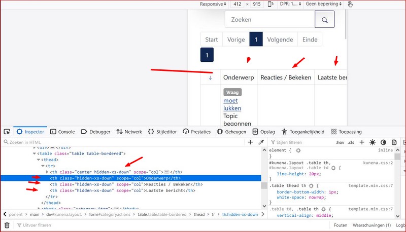
Here are two screenshots from category-view. First from this forum. There is only one single column, which contains the essential information. More is really not necessary.

The second screenshot is from my forum, where two columns are displayed. This means to me the template doesn't respond to mobile devices.
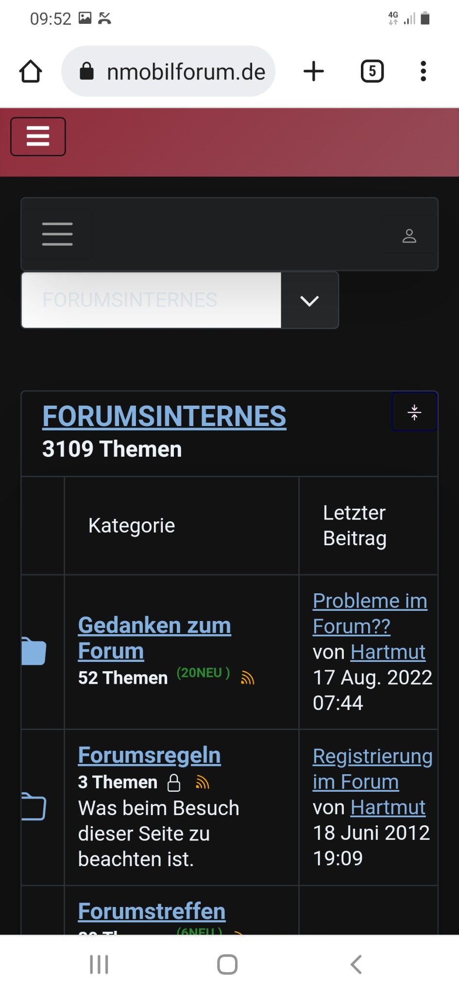
In topic view it is even worst, there are three columns...
 , while this (Kunena) forum still only displays one single column
Maybe one of the developers of the template has an idea for a workaround/override to achieve the removal of the superfluid columns?
thanks for your investigation
Here are two screenshots from category-view. First from this forum. There is only one single column, which contains the essential information. More is really not necessary.
The second screenshot is from my forum, where two columns are displayed. This means to me the template doesn't respond to mobile devices.
In topic view it is even worst, there are three columns...
Maybe one of the developers of the template has an idea for a workaround/override to achieve the removal of the superfluid columns?
Last edit: 3 years 10 months ago by unker.
Please Log in or Create an account to join the conversation.
3 years 10 months ago - 3 years 10 months ago #224394
by Leen
With kind regards
Leen
Replied by Leen on topic Template Behaviour on Mobile Device
Hi Unker,
well I'm looking for where exactly it is arranged but I'm not a programmer so maybe a better answer will come later how to turn this off.
well I'm looking for where exactly it is arranged but I'm not a programmer so maybe a better answer will come later how to turn this off.
With kind regards
Leen
Last edit: 3 years 10 months ago by Leen.
The following user(s) said Thank You: unker
Please Log in or Create an account to join the conversation.
Time to create page: 0.249 seconds