- Posts: 15
- Thank you received: 0
Kunena 7.0.4 Released
The Kunena team has announce the arrival of Kunena 7.0.4 [K 7.0.4] in stable which is now available for download as a native Joomla extension for J! 5.4.x/6.0.x. This version addresses most of the issues that were discovered in K 6.2 / K 6.3 / K 6.4 and issues discovered during the last development stages of K 7.0
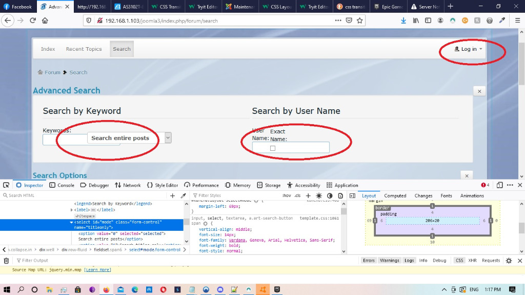
Solved Advanced search layout is wrong
1. Is the layout of the advanced search section on the search menu item.
2. The login button on the nav bar doesn't seem to be working correctly.
I have attached a photo and the configuration report.
Database collation check: ✔ The collation of your table fields are correct
Joomla! SEF: Enabled | Joomla! SEF rewrite: Disabled | FTP layer: Disabled |
This message contains confidential informationhtaccess: Exists | PHP environment: Max execution time: 30 seconds | Max execution memory: 128M | Max file upload: 2MKunena menu details:
Warning: Spoiler!
ID Name Menutype Link Path In trash 200 Forum mainmenu Itemid=202 kunena-2021-04-19 No 202 Forum kunenamenu view=home&defaultmenu=204 forum No 203 Index kunenamenu view=category&layout=list forum/index No 204 Recent Topics kunenamenu view=topics&mode=replies forum/recent No 205 Unread kunenamenu view=topics&layout=unread forum/unread No 206 New Topic kunenamenu view=topic&layout=create forum/newtopic No 207 No Replies kunenamenu view=topics&mode=noreplies forum/noreplies No 208 My Topics kunenamenu view=topics&layout=user&mode=default forum/mylatest No 209 Profile kunenamenu view=user forum/profile No 210 Help kunenamenu view=misc forum/help No 211 Search kunenamenu view=search forum/search No Joomla default template details : dronzColours912 | author: | version: 1.0 | creationdate: 2021-05-09
Kunena default template details : Crypsis | author: Kunena Team | version: 5.2.4 | creationdate: 2021-04-04
Kunena template params:
Warning: Spoiler!
DefaultCategoryicon profileIconset default DefaultIconset default editorIconset default bootstrap 1 icomoon 1 tooltips 1 borderless 1 SubjectLengthMessage 80 fullactions 1 quick 0 displayMenu 1 displayDropdownMenu 1 displayDropdownContent 1 displayModule 1 displayBreadcrumb 1 displayAnnouncement 1 displayFooter 1 avatarPosition left avatarType img-circle labels 0 whoisonlineName default formRecover 0 topicicontype B2 fontawesome 0 fontawesome_layer_v4 0 socialshare 0 socialsharetag socialtheme classic optional_username 0 writeaccess 0 localstorage 0 IconColor inherit IconColorNew #48a348 Bold 1 Italic 1 Underline 1 Strike 1 Subscript 1 Superscript 1 RemoveFormat 1 BulletedList 1 NumberedList 1 Blockquote 1 JustifyLeft 1 JustifyCenter 1 JustifyRight 1 JustifyBlock 1 Link_Unlink 1 Image 1 Smiley 1 Confidential 1 Hidetext 1 Spoiler 1 Code 1 Ebay 1 1 1 Soundcloud 1 FontSize 1 TextColor 1 Maximize 1 Map 1 Video 1 editorButtons nameskinckeditor ckeditorcustomprefixconfigfile avatarSizeX 40 avatarSizeY 90 avatarSizeXThumb 36 avatarSizeYThumb 36 avatarSizeXWelcome 72 avatarSizeYWelcome 72 avatarSizeXList 36 avatarSizeYList 36 avatarSizeXPost 144 avatarSizeYPost 144 avatarSizeXProfile 200 avatarSizeYProfile 200 templatebyText templatebyName templatebyLink
Kunena version detailed: Kunena 5.2.4 | 2021-04-04 [ Koios ]
| Kunena detailed configuration:| Kunena integration settings:Warning: Spoiler!
Kunena config settings: board_offline 0 enablerss 1 threads_per_page 20 messages_per_page 6 messages_per_page_search 15 showhistory 1 historylimit 6 shownew 1 disemoticons 0 template crypsis showannouncement 1 avataroncat 0 catimagepath category_images showchildcaticon 1 rtewidth 450 rteheight 300 enableforumjump 1 reportmsg 1 username 1 askemail 0 showemail 0 showuserstats 1 showkarma 1 useredit 1 useredittime 0 useredittimegrace 600 editmarkup 1 allowsubscriptions 1 subscriptionschecked 1 allowfavorites 1 maxsubject 50 maxsig 300 regonly 0 pubwrite 0 floodprotection 0 mailmod 0 mailadmin 0 captcha 0 mailfull 1 allowavatarupload 1 allowavatargallery 1 avatarquality 75 avatarsize 2048 imageheight 800 imagewidth 800 imagesize 150 filetypes txt,rtf,pdf,zip,tar.gz,tgz,tar.bz2 filesize 120 showranking 1 rankimages 1 userlist_rows 30 userlist_online 1 userlist_avatar 1 userlist_posts 1 userlist_karma 1 userlist_email 0 userlist_joindate 1 userlist_lastvisitdate 1 userlist_userhits 1 latestcategory 0 showstats 1 showwhoisonline 1 showgenstats 1 showpopuserstats 1 popusercount 5 showpopsubjectstats 1 popsubjectcount 5 showspoilertag 1 showvideotag 1 showebaytag 1 trimlongurls 1 trimlongurlsfront 40 trimlongurlsback 20 autoembedyoutube 1 autoembedebay 1 ebaylanguagecode en-us sessiontimeout 1800 highlightcode 0 rss_type topic rss_timelimit month rss_limit 100 rss_included_categories rss_excluded_categories rss_specification rss2.0 rss_allow_html 1 rss_author_format name rss_author_in_title 1 rss_word_count 0 rss_old_titles 1 rss_cache 900 defaultpage recent default_sort asc sef 1 showimgforguest 1 showfileforguest 1 pollnboptions 4 pollallowvoteone 1 pollenabled 1 poppollscount 5 showpoppollstats 1 polltimebtvotes 00:15:00 pollnbvotesbyuser 100 pollresultsuserslist 1 allow_user_edit_poll 0 maxpersotext 50 ordering_system mesid post_dateformat ago post_dateformat_hover datetime hide_ip 1 imagetypes jpg,jpeg,gif,png checkmimetypes 1 imagemimetypes image/jpeg,image/jpg,image/gif,image/png imagequality 50 thumbheight 32 thumbwidth 32 hideuserprofileinfo put_empty boxghostmessage 0 userdeletetmessage 0 latestcategory_in 1 topicicons 1 debug 0 catsautosubscribed 0 showbannedreason 0 showthankyou 1 showpopthankyoustats 1 popthankscount 5 mod_see_deleted 0 bbcode_img_secure text listcat_show_moderators 1 lightbox 1 show_list_time 720 show_session_type 2 show_session_starttime 1800 userlist_allowed 1 userlist_count_users 1 enable_threaded_layouts 0 category_subscriptions post topic_subscriptions every pubprofile 1 thankyou_max 10 email_recipient_count 0 email_recipient_privacy bcc captcha_post_limit 2 image_upload registered file_upload registered topic_layout flat time_to_create_page 1 show_imgfiles_manage_profile 1 hold_newusers_posts 2 hold_guest_posts 0 attachment_limit 8 pickup_category 0 article_display intro send_emails 1 fallback_english 1 cache 1 cache_time 60 iptracking 1 rss_feedburner_url autolink 1 access_component 1 statslink_allowed 1 superadmin_userlist 0 legacy_urls 1 attachment_protection 1 categoryicons 1 avatarresizemethod 1 avatarcrop 0 user_report 1 searchtime 365 teaser 0 ebay_language 0 allow_change_subject 1 max_links 6 read_only 0 ratingenabled 0 url_subject_topic 0 log_moderation 0 attach_start 0 attach_end 14 attachment_utf8 1 autoembedsoundcloud 1 emailheader media/kunena/email/hero-wide.png user_status 1 signature 1 personal 1 social 1 plain_email 0 moderator_permdelete 0 avatartypes gif, jpeg, jpg, png smartlinking 0 defaultavatar nophoto.png defaultavatarsmall s_nophoto.png quickreply 1 avataredit 0 activemenuitem mainmenu_id home_id index_id moderators_id topiclist_id misc_id profile_id search_id avatar_type 1 sef_redirect 1 allow_edit_poll 1 use_system_emails 0 autoembedinstagram 1 disable_re 0 email_sender_name Dronezz display_filename_attachment 0 new_users_prevent_post_url_images 0 minimal_user_posts_add_url_image 10 | Joomla! detailed language files installed:Warning: Spoiler!Kunena - Finder Disabled
Kunena - AltaUserPoints Disabled
Kunena - Community Builder Disabled
Kunena - Easyblog Disabled
Kunena - Easyprofile Disabled
Kunena - Easysocial Disabled
Kunena - Gravatar Disabled
Kunena - JomSocial Disabled
Kunena - Joomla Enabled: access=1 login=1
Kunena - Kunena Enabled: avatar=1 profile=1
Kunena - UddeIM Disabled
Warning: Spoiler!
Joomla! languages installed: en-GB English (United Kingdom) Third-party components: None
Third-party SEF components: None
Plugins: None
Modules: None
Please Log in or Create an account to join the conversation.
Important! Always create a backup before you make any changes to your website!
Please Log in or Create an account to join the conversation.
Thanks for having a look.
Dom
Please Log in or Create an account to join the conversation.
Or search the issue with the method of elimination. Test it first with the Joomla default template Protostar. Is the error still present, disable all non default extensions one by one, to find the cause.
Unfortunately, I cannot help more without seeing it.
Important! Always create a backup before you make any changes to your website!
Please Log in or Create an account to join the conversation.
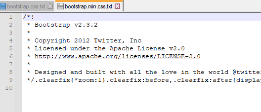
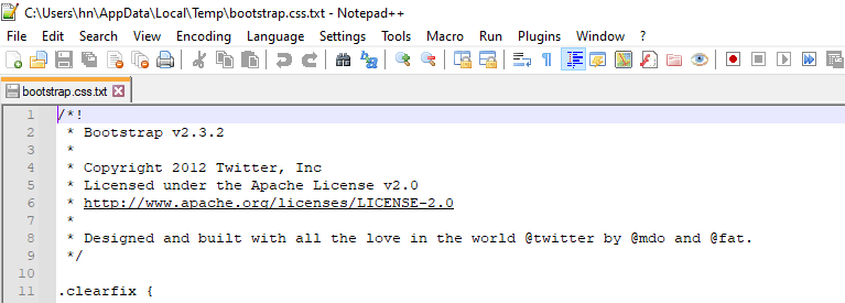
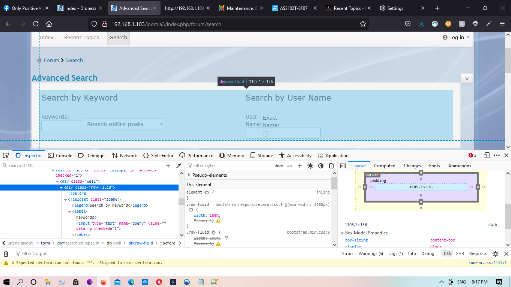
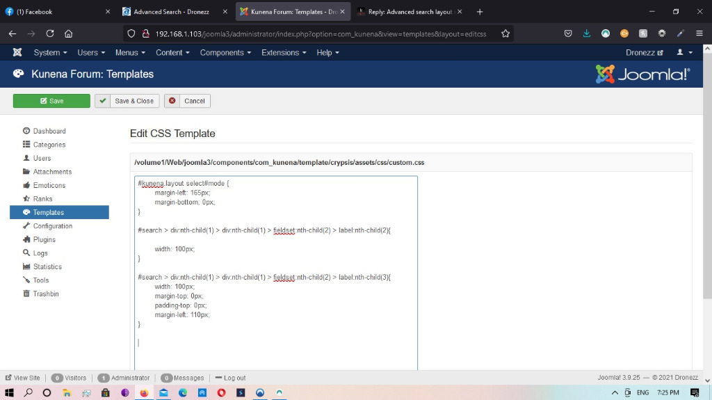
I have attached an image so you can have a giggle at my css skills!
it's working on desktop but i shudder to think what it will do responsively?
##EDIT##
Is there a way to separate the custom.css between responsive and desktop mode?
Regards
Dom
Please Log in or Create an account to join the conversation.
Yes, it's possible, if you address it to the desktop size.Is there a way to separate the custom.css between responsive and desktop mode?
In this example, the code effect begins from a size of 1024 px.
Important! Always create a backup before you make any changes to your website!
Please Log in or Create an account to join the conversation.


