
Kunena 7.0.4 Released
The Kunena team has announce the arrival of Kunena 7.0.4 [K 7.0.4] in stable which is now available for download as a native Joomla extension for J! 5.4.x/6.0.x. This version addresses most of the issues that were discovered in K 6.2 / K 6.3 / K 6.4 and issues discovered during the last development stages of K 7.0
Loved Kunena 2.0 - a moderator's view
Before we begin, it's important that we get two important ground-rules properly established.
- Any images that we post in this topic are based on a work-in-progress. These images are not an official endorsement of what the finished product will look like. They are merely an illustration of people may encounter with the new version.
- I don't know everything!
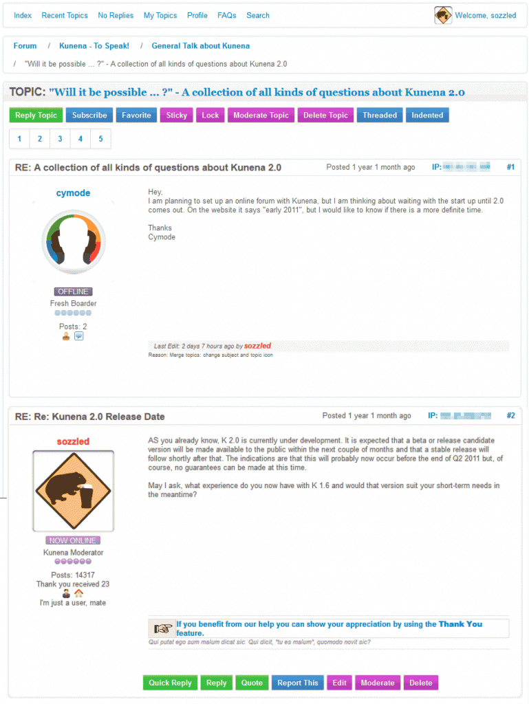
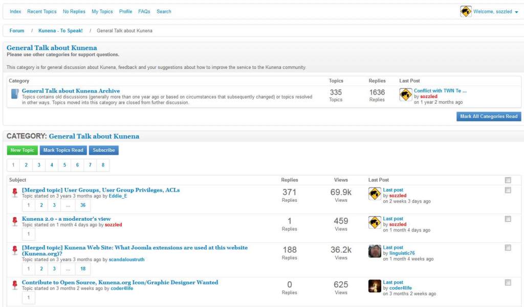
You will have already seen a few cosmetic changes at this site including the use of new topic icons. Perhaps one of the biggest changes we expect will be the introduction of new tableless templates, the first of which is called Mirage. The two images below illustrate parts of the Kunena forum, here at www.kunena.org , rendered using the Mirage template.
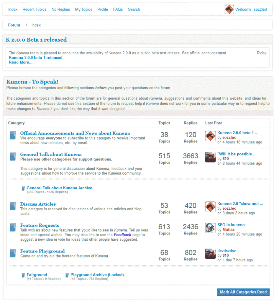
As you can see, one of the neat features is the ability to mark all topics "read" on a category-by-category basis instead of marking all topics "read" on a whole-of-forum basis.
Quite apart from being more "colourful", the individual category index pages make the possible actions more clear for the users of your forum, as the following image shows:
Blue Eagle vs. Crypsis reference guide
Read my blog and

Please Log in or Create an account to join the conversation.
Blue Eagle vs. Crypsis reference guide
Read my blog and
Please Log in or Create an account to join the conversation.
Blue Eagle vs. Crypsis reference guide
Read my blog and
Please Log in or Create an account to join the conversation.
A test/sandbox site is always necessary - it usually takes about one hour to build one. Any serious site manager understand the importance of having a test site, separate from a production site and with its own database, as a place to evaluate new versions of software.
If people have a sandbox/test site now then, when the K 2.0.0 stable version is released it should only take a hour for people to verify that everything is all right. We estimate that K 2.0.0 will be released (barring major mishaps, etc.) very soon - two weeks - after K 2.0.0 RC2. Even with the cautionary advice that we always issue to people who use RC versions, we do not anticipate introducing any changes between this last RC version and the final public release; that's not say that further changes will not be introduced, of course.
")
Therefore, to "cut to the chase", a test/sandbox site is always necessary to have on hand. It usually takes about one hour to build one.
It is vital that people the test site quarantined from their production site. If your test site shares the same database as your production site, changes on your test site could seriously compromise your business-as-usual operations. The database for K 2.0 is structurally different to the database to K 1.7; the upgrade process makes structural alterations to an existing K 1.7 database. Please read through the release notes for K 2.0 in the Wiki.
We recommend that people not wait for K 2.0.0 stable to "happen" but that they download and install a release candidate (or beta version) of K 2.0.0 on a test site in order to evaluate (a) the upgrade process, (b) the overall reliability, and (c) the differences between K 1.7 and K 2.0. The sooner that people expose themselves to any potential issues, and the more experience that people gain, there will be a lower chance of people reporting problems on the day when K 2.0 stable happens.
Blue Eagle vs. Crypsis reference guide
Read my blog and
Please Log in or Create an account to join the conversation.
I really like the new design. Compared to the Blue Eagle template it's waaay better. You're doing a great job!
I've taken a look at your attached pictures and I have some suggestions - it's only suggestions, and I know that you may not agree with all of them. Sorry for my slightly bad english..
1) I like the template as clean and simple as possible. In my opinion there's no need to write the text 'Topics' and 'Replies' on the front page to the right of each category title. It is already stated in the header what the numbers mean. Same goes for the 'Replies and 'Views' in the category view.
2) Under Last Post (Front page) I would like an option to not show the profile picture, thereby making more space for the topic title (more important in my eyes).
Same goes for the Last Post in the category view.
3) I think the categories should be directely below the section title, with no white space between section title and categories (as in the Blue Eagle template). Also I think the categories should be the same width as the section title; i don't like the way that the categories is inclosed in a frame (from the section title).
4) The top menu bar (Index, Recent Topics, etc.) should also have a memberlist link.
5) I don't get the idea of showing 'Time to create page'. I guess my users really don't care (they can feel it themselves)...
6) I would like to be able to disable the "mark all topics "read" on a category-by-category basis". The botton takes up to much space, and makes the forum look a bit messy.
I rather prefer one button in the bottom of the forum, for example with a drop down menu to the left where you can assign which sections/categories the button should be assigned to.
7) In the category view there is a lot of white space to the right of the top buttons (New Topic, etc.) and the page numbers. I would prefer them to be gathered into the same line. For users with small screens this otherwise causes a lot of (or some) scrolling..
") In the category view in the Last Post coloumn the text 'Last post' should be removed - OR the text 'by username' should be moved up to the right of the 'Lasp post' text.
In the category view in the Last Post coloumn the text 'Last post' should be removed - OR the text 'by username' should be moved up to the right of the 'Lasp post' text.9) In the category view if a post has more than 10 replies the page numbering takes up a lot of space. I would prefer it like on phpbb, eg. small buttons at the right of the 'Topic started' text.
10) In the category view the text 'Topic started on x year x month ago by xxx' should be replaced with 'by xxx » x year x month ago'. Takes up less space and look more clean and simple.
11) In the topic view there is to much framing going on. I would prefer the topic title not to have a frame inclosing all the replies. Instead the topic title should just be a horizontal bar, and the with of the replies should be the same as the topic title bar.
12) I don't get the text 'If you benefit from our help you can show your appreciation by using the Thank You feature.'. Why not just have a facebook-ish like button instead.
Best regards
Lasse
Please Log in or Create an account to join the conversation.
I would like to make two quick comments at this time:
Grubbe wrote:
This is configurable in K 2.0 and you can switch it off.5) I don't get the idea of showing 'Time to create page'. I guess my users really don't care (they can feel it themselves)...
Grubbe wrote:
That's just me! :laugh: It's part of my signature!12) I don't get the text 'If you benefit from our help you can show your appreciation by using the Thank You feature.'. Why not just have a facebook-ish like button instead.
Blue Eagle vs. Crypsis reference guide
Read my blog and
Please Log in or Create an account to join the conversation.