Kunena 6.2.6 released
The Kunena team has announce the arrival of Kunena 6.2.6 [K 6.2.6] which is now available for download as a native Joomla extension for J! 4.4.x/5.0.x. This version addresses most of the issues that were discovered in K 6.1 / K 6.2 and issues discovered during the last development stages of K 6.2
Question
Add the ability to add classes to buttons in the Widget/Button factory.
Crypsisb3\layouts\widget\button\default.php
Modify desired template to add $btnclass:
ComponentKunenaControllerMessageItemActionsDisplay
Add $btnclass to getButton function and extend the properties sent to the factory
This part is optional as you have expressed that you do not want to colorize the buttons such as delete, but users that do would simply only change this:
Please Log in or Create an account to join the conversation.
So if you want your changes, you only need to add this on your custom.less
Please Log in or Create an account to join the conversation.
Good idea and it's certainly a lot easier than constructing CSS like810 wrote: I have improved the button now. They have now IDs with the button names.
I like some of jhebbel's ideas.
If we could only extend the use of TITLE or ALT attributes to other buttons/widgets/glyphs within Crypsis, we would have a template that's actually accessible to visually-impaired forum users, eh?
Blue Eagle vs. Crypsis reference guide
Read my blog and

Please Log in or Create an account to join the conversation.
810 wrote: i have improved the button now, they have now id's with the button names.
So if you want your changes, you only need to add this on your custom.less
Code:#btn_report { background-color: #ec971f; } #btn_delete { background-color: #c9302c; }
Thats a good step, but my goal was to be able to implement bootstrap classes into the buttons without creating new css for them, both certain acheive the end result, but bootstrap ensures everything will be nice an uniform. Otherwise why even use BS.
Also, in your implementation, they should probibly be classes not IDs, as I believe the CSS spec states IDs *should* be unique.
This stuff is just my own implementation changes I am making
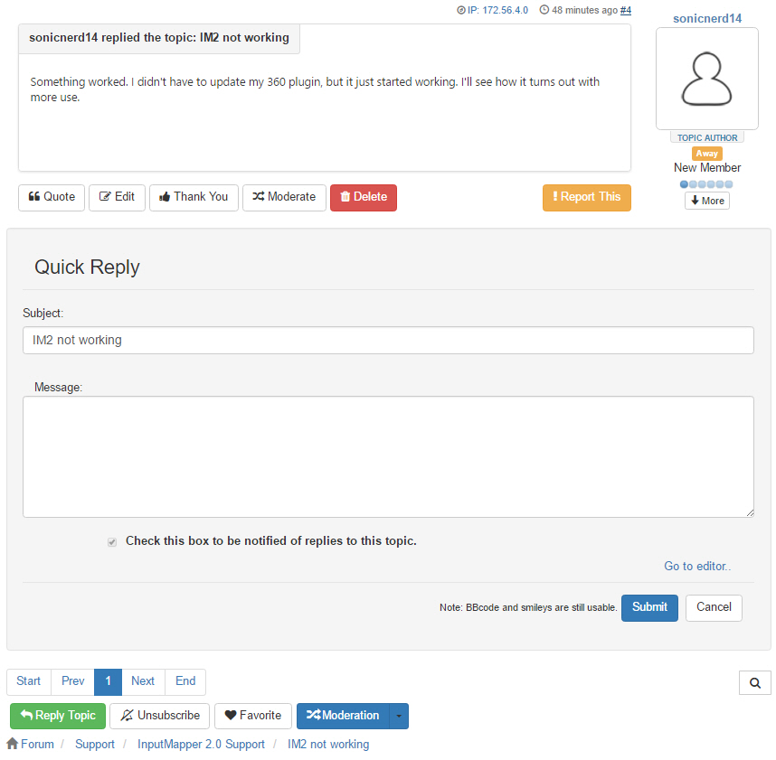
I notice that in RC 3 there are 2 delete buttons, one created if you are a mod and one created if you are the author, I combined these into 1 as 2 are not needed. Also brought the message buttons to a single line and got rid of the reply that was under each post (repetitive). I also broke out the actions dropdown for the topic.
This is starting to look a lot more like what I and my users have come accustomed to, still got a lot more work I want to do however and not enough time lol.
Please Log in or Create an account to join the conversation.
I also broke out the actions dropdown for the topic
This is already a option: Edit template - basic settings - Show default actions = No
If you want to turn off groups
Please Log in or Create an account to join the conversation.
810 wrote:
I also broke out the actions dropdown for the topic
This is already a option: Edit template - basic settings - Show default actions = No
If you want to turn off groups
Unless its a bug, that only did it for the messages' dropdowns, my goal was to do it for the actions dropdown at the bottom of the topic aswell thus surfacing the "Reply Topic" button. I did however keep the Moderation for the topic in a dropdown as it is lesser used. Again, the second half of my post were just things I found aesthetically pleasing, some people may not want it the way I am doing it.
Please Log in or Create an account to join the conversation.
Think about mobile and tablet.
Please Log in or Create an account to join the conversation.
Please Log in or Create an account to join the conversation.
One of the biggest criticisms about Crypsis is that the UX is not friendly; that's not my criticism and it's not the only criticism. Of course, the use of small-screen/touch-screen/mobile devices is important (I don't think anyone's denying that). The problem for new users of Crypsis is that the layout of the UI is not intuitive. I think that's what jhebbel is trying to address.810 wrote: are you sure, you want 7 buttons next each other?
Think about mobile and tablet.
Blue Eagle vs. Crypsis reference guide
Read my blog and

Please Log in or Create an account to join the conversation.
sozzled wrote:
One of the biggest criticisms about Crypsis is that the UX is not friendly; that's not my criticism and it's not the only criticism. Of course, the use of small-screen/touch-screen/mobile devices is important (I don't think anyone's denying that). The problem for new users of Crypsis is that the layout of the UI is not intuitive. I think that's what jhebbel is trying to address.810 wrote: are you sure, you want 7 buttons next each other?
Think about mobile and tablet.
Yea, my concern right now it to improve the UI for desktop users, once that in a place I am happy with I fully plan to revisit how it looks on mobile and make it fully responsive, perhaps even collapse many of the options back into dropdown menus. Regardless of mobile though I still stand firm that Reply Topic should alwayse be its own button.
My goal for tomorrow if I dont find myself at a bar, will be to tweak and minimize a lot of the white space, then ensure that the differences between posts is clear (the proximity coupled with the added buttons makes this a tad hard to distinguish.
Please Log in or Create an account to join the conversation.

